Marketers spend millions on the mining of opportunities to connect with an audience, but merely connecting with people is not enough. Gold is struck when a connection results in the audience taking action.
In the digital world, “taking action” usually means a click (or on-screen tap), which paves the way to a conversion.
What people actually have to click on, namely the Call-to-Action (CTA) Button, is often neglected. An effective call-to-action button can dramatically increase Click-Through Rates (CTR) which in turn could dramatically increase conversion rates.
The CTA button contains two primary elements, namely design and content:
• Button design is the visual aspect of the button. The design should lure the viewer’s eyes to notice it and should provide an answer to, “Where do I click?”
• The Content should convince the visitor that they want to take action and should provide an answer to, “Why should I click?”
Strike conversion-gold with our 10 Tips to get Your Audience Clicking:
CTA Button Design
1. Colour & Contrast
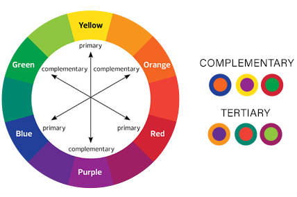
Although colours matter (colour psychology is pretty fascinating stuff), we believe that the best colour for your button is the colour that is differentiated from the rest of the design. A well-designed banner/page has elements that work together to draw attention to the focal point, the CTA. Never underestimate the power of contrasting colours to make a button stand out to your viewers!

2. Shape
Button shape can play an important role when creating your CTA button. Rectangular buttons are by far the most popular. You’ll need to decide whether you want to go with a more rounded button shape or a button with square edges. Both styles can perform well in different settings, although there is data that suggests that rounded corners might perform better. Ideally we suggest that you test shapes and see what works best.
3. Size
With mobile now arguably being the most popular platform for browsing and consuming email, the size of CTAs are directly influenced. Touching a CTA button on mobile with your thumb is vastly different than the control provided by a mouse on a desktop or laptop. Mobile users become frustrated when buttons are too small or placed too closely together and as we know, frustration leads to abandonment! Buttons should be big enough to be easily tapped on a mobile phone, but not so big that it compromises the overall design. As a great starting point, we recommend making CTA buttons at least 25 pixels square.
4. Placement & Spacing
CTA buttons shouldn’t be competing for attention. It should be immediately clear what you want the viewer to do. At the same time your CTA button should not be left in the wilderness totally removed from your message. Another important point to consider is that surrounding a buttons with white or negative space space helps it stand out. Along with making CTA buttons big enough, you need to provide generous spacing around them. The rule of thumb is to put your button in a spot where the viewer can see it at the right time. Every page has a flow of supplying information in an organized way. Never force users to backtrack in order to click a button. Make sure that your button appears in appropriate places that fit in with the sequence of how the information is supplied.
5. Button Graphics
In some instances, small arrows or graphics on your button can assist with click-through-rates. When making use of graphics, ensure that your icons clarify rather than confuse.
CTA Copy
1. Text Size
Your button text should be big enough to draw attention and to read easily, but not so big that it completely dwarfs the rest of the content. According to studies large lettering may subconsciously affect users negatively. Your button text should be big enough to draw attention, but not so big that it completely overshadows the rest of the content.
2. Use Action-oriented Text
The best call-to-action phrases include the use of strong verbs. Use an active, energetic verb to drive more clicks. Try words such as Discover, Join, Book, Get, Start etc.
3. Be Brief
Button text shouldn’t go on and on. Ideally you’ll want to keep button text between two and six words.
4. Consider First Person
A recent study found that using first-person language – “Get my free template” vs. “Get your free template” – resulted in a 90% increase in clicks! We suggest you test how changing your CTA buttons to first-person (essentially putting yourself in your customer’s shoes) affects your Click-Through Rates.
5. Create a Sense Of Urgency
A CTA’s primary purpose is to get someone to take action right away. Creating a sense of urgency in your call to action buttons can increase click-through rates. Try using something like this:

Even just adding “now” to your copy creates a sense of urgency for users:

Share this post:

Hermanus is an experienced email media and marketing strategist with a strong sales background. Passionate about helping clients and partners acquire, convert, and retain customers. As a proponent of authentic and honest messaging he believes that done is better than perfect.
Lover of wit, irony, golf, family and Africa.


